A bella and some coloring
>> Tuesday, December 30, 2008
I desperately need to clean up my craft room (not to mention the rest of my house!) but i've been promising this coloring tutorial for DAYS and this bella card i created for Christi's color challenge nearly 2 weeks ago! Sheesh! Time to get on the ball i suppose since i no longer have holidays, family or traveling for excuses! :)
First... my card...
Christi's color challenge was to use one of my favorite color combinations, turquoise, chocolate and white. These colors ALWAYS look great together, and i think it's hard to find anyone who disagrees so this is a great color combo to use when doing something for someone else as well! I used my fairly new content-to-be-a-bella from Stamping bella. Isnt she just so cute! I also used Jen's sketch for you to try from a couple of weeks back. and i opted to not include a sentiment so i can stamp whatever i need at the time on the inside.
Other deets
patterned paper - cloud 9
cardstock - hobby lobby
flower punches - fiskars
other accessories - cuddlebug folder tiny mosaic, bling from studio g
coloring medium - copic markers
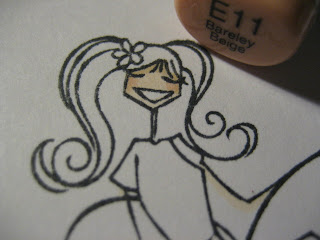
And now onto my mini coloring tutorial! I've been asked by quite a few people "how i color". Well, i do like to play with a few different techniques depending on the end result i'm wanting, but here is my most common way of coloring.
1. I prefer copic markers. I just like the end result the best and they blend so well. If there is interest i'll do some coloring tutorials on how i color using water based markers and other mediums.
2. When using copics i generally always color in a rounded motion (either circles or something like figure 8's. This keeps the edges wet and helps aid in blending.


6. I'm not sure if i didnt take a picture of this step, or if it's actually the above picture, but i go over the entire face again with E00 or maybe E000 to blend everything together. Again, i use circular motions. on a larger face i still concentrate the most color towards the outside and almost leave the forehead with the just first layer of color.
7. Now i go one everything else, usually clothing next. However i follow the same method. Lay down 1 layer of the lightest color. Then follow the outer edges with a darker color. Then color over the whole thing again to blend. To show you the difference, i took a step by step approach to 3 of the flower petals Miss Bella is sitting on...

Ok, and here is the whole image colored in...
For her shirt i used a light color and i actually didnt have a very good shading color. they were all too dark. So i used a technique (that i used to do alot, but not as much anymore) called Tip-to-tip coloring. Just use the tip of the lightest color and swip it on the tip of the darker color and shade along your edges that way. it takes a little longer, but it's a great way to use your markers if you dont have a bunch yet. You can make almost any color blend together this way. This is why i used to use it all the time, i had fewer markers! Now that my marker collection has grown, i dont need to do the tip to tip as much. :)
Along the entire outer edge of the image i use a neutral gray (or sometimes a very very light blue like b000) to outline outside the lines. it really makes the image stand out.
And that is pretty much how i color. :)


11 comments:
Great card and a good tutorial!!
Thanks for the tutorial! I love to see how different people color and use techniques. And I love the card! That is my favorite color combination also!
Nice card! Love the tutorial. So simple.
Pretty Card and Thanks for the Tutorial!
thanks so much! now I need to find someone with the copics I can borrow to try out!
what a great card and thanks so much for the great tutorial. It helped alot.
This is gorgeous girl!! Thank you so much for playing along in my challenge!!
I love your Card Katie!!!
I am not a lover of brown in any way shape or form, but it looks great with these colors!!!!
I actually used Browns on my card for today which is so out of the norm for me!!!
Your tutorial is great!!!
TFS!!!
Heather
Lovely card. Thanks for the coloring tips =)
Thanks a bunch for this tutorial! My copic collection is gradually growing and now I know how to better select future purchases!! Happy New Year!
Cute card!! Thanks for the tutorial!!
Post a Comment