I'm going to warn you... this is going to be a long post... with lots of pictures! :) But there a reason... a tutorial reason! :) But let me first start off with the final product and the deets of this card. :) Then if you care to read on about the tutorial.... you can! :)

Because the rest of this post is going to be long winded... i'm going to skip my usual babble (hey, i hear those of you breathing a sigh of relief!) and get right to....

Stamps:
Rain Snow Shine from The Greeting Farm
Sentiment is a misc stamp i picked up at AC Moore on clearance... sorry i dont have much more info on it.
Coloring/Copics
Hair, Skirt, Boots, Buttons: E25, E27, E29, Colorless Blender
Skin: E00, E21(shadow), E02(cheeks), E000 (to blend it all together)
Jacket: YR12, YR14, YR18
Umbrella: YR00, YR12
Socks: E40, E41
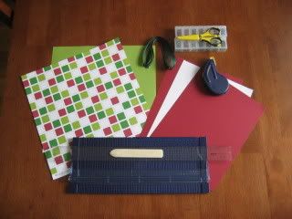
Paper:
Patterned Paper from Tart N Tangy (or whatever that paper collection was called! Sorry!) from Stampin Up
Cardstock is Chocolate from Stampin Up
White is Solar White by Neenah
Tools and Accessories:
Labels 4 Nestabilties by Spellbinder
Spica Pen in Sand (border of die)
Martha Stewart BorderPunch
Dark Chocolate ribbon by PaperTrey Ink
Flowers by Prima Marketing
Buttons from the jar
White Thread is cross stitch thread by DMC
Glossy Accents (ranger) for dew drops/rain on the flowers
. You do not have to be a member of the club to see the goodie info on the club blog, you DO have to be a member of the club to get some hefty discounts on marker orders, take free classes (or be mailed the class info) and a lot more. Contact Stephanie thru the FMS's blog to get some more info on how to join! Cost is $10 a month unless you pay for multiple months at a time. :)
It was requested/suggested that I do a little tutorial on the the copic bundle colors for June. Well, June is about over, but here it is anyway! You still have time to order your bundle colors from Stephanie! Just head into the store or give her a shout to order! Club members of course get 35% off of the retail price of this bundle. :)
The copic bundle of the month is E25, E27, E29. These are LOVELY rich colors that you can have wonderful results with! But to some, they can be a bit tricky. Which is why it was asked that i do a little tutorial on them! No probbie, i say! But let me first say that there are multiple ways to get some neat effects with this color combo. This tutorial is simply 1 way! Check out
THIS POST on the copic munkie blog to see 3 different ways to color the same image using this combo. You'll see 3 very different looks! See how fun copics can be!!!
Alright... now before i begin, i want to say that as you layer E25, it can get a bit darker than you were wanting it to be in the first place. This is just something you should keep in the back of your head. I'm also going to show you a bit of the "flick" or "feathering" method of coloring hair. We also did this in the club class this month, so keep your peepers out for another tutorial using this method and grey markers!
Here's how i started the hair... with E25...

Around the area that you'd like to have your highlight, you are going to flick or drag your marker into the white area. Let the marker lightly leave the paper in a flicking motion. This will help you get a gradual fade into the white. No we arent gradual yet... we will get there. :)
Step 2... add in E27

In the same flicking motion, add in your E27, but dont go as far as you did with the E25. Also add some E27 into the bottom portion of her hair as a shadow just as you normally would shadow (around the edges, maybe a few strands of hair, etc)
Step 3... add in your E29

I tend to use my darkest colors sparingly. Dont get me wrong, they are needed to get that depth, but too much and the whole thing just turns dark on me. And i like to still see my stamp lines. So i add E29 just to the very ends and then flick in a wee bit in her "hair part". Dont forget you can always click on the photo to view it larger!
Step 4... blending them all together... go back to E25.
Go over it all with E25 to blend. Remember anywhere you layer your E25, it's going to get darker. If you view closely, there are some spots that i did NOT layer so i that part would remind slightly lighter. If the area that is left white still have to hard of a contrast for your personal taste, quickly go over that area and the edges of the flicking with your colorless blender. I actually did this and you can see it in the final pic but i forgot to take a picture of this step. WOOPS. Or maybe it was deleted by mistake since there is a number missing from my picture sequence. In any case... it's easy. Just remember to "tornado" quickly and take a break as it will lighten up a smidgen more even after you've stopped using the marker because of the "drying time".
Next part of the image... her skirt!
Now again, because this color combo is a darker one, i like to leave some areas white so when i go over the whole thing to blend, it doesnt get too dark on me. Also, when i add a a dark color as my main color, i do like to start with the edges/shadows first so that i can still see my stamp lines. Not always, but it is my norm with this particular color family. In this case, I've started with my shade color of E27 because there just isnt enough space in the image to get too wild with a bunch of different colors.
Skirt step 2
Go over the whole thing with your lightest color, E25. If you want more of a gradual blend that you see here, concentrate your E25 color over the E27 more so than when you are adding it over your white space.
Boots step 1

Again, use one of your darker shade colors (in this case, E27) to draw in your shadows. I actually added in to the tip of her boot to give her those "boxy" knee highs. It'll help to get some added depth to the image.
Boots Step 2

Go over the boot with your E25. I actually layered E25 a second time over the far right boot because if you look carefully, it's actually a little bit further back/behind her left leg. You can tell this because the edge/tip of her boot is actually higher in the drawn image, making it further back.
So thats how i like to color with this color combo. If you own this color combo, my suggestion is to just play with it numerous ways with layering until you find what is comfortable for you!
Read more...