My Time Made Easy Blog Hop: Back to School
>> Monday, August 1, 2011
Today is the official release from My Time Made Easy!!!!
You can check out all the new goods in the store right now just by clicking HERE.
Today the MTME design team has a bit of a blog hop for you as we always do on the 1st of the month! And in our traditional fashion, we are giving you a card crazy hop full of LOTS of cards!
And we are all using the new digi set, Back to School!
Now... i decided to go a bit out of my comfort zone for my cards for you, and i'm actually kinda pleased with the results!
I have often told people... my card design skills are ehhhhh, not so super fab. I have a hard time coming up with the über fabulous layouts and creative new ways to do things on a card. Where my comfort is... is in coloring. I'm not the worlds best color'er... but i'm confident in the skills i have. So this time... i decided to EEEEEEEEK, not use my copic markers! I even had everything printed out and then i thought... ya know what... i'm going to try to see how fab i can make these stamps using all computer skills! I also tried to take bits and pieces and layer them to create images since thats one of the glorious things about digi stamps!
SO first... here's a peek at what this stamp set, Back to School, looks like...
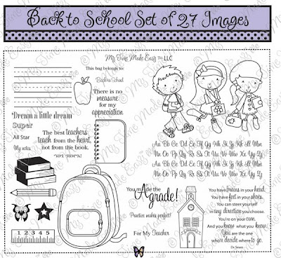
So you can see the super cute little boy image i used yesterday (i just singled out the boy instead of using all 3 kiddos). Then there are quite a few sentiments both short and long as well as LOTS of other images, some of which are perfect to layer!!!
Onto the cards...
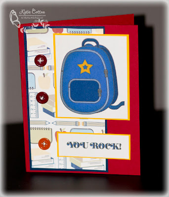
Here's the first using some of my paper scraps from my project yesterday. All the paper used on my cards today is from the Academic Hodge Podge paper pack available here.
First I took the backpack image from the set and then layered the star over it. I use photoshop, so i used the paintbucket to then color the star from black to yellow and also to color in the other pieces of the backpack. THEN... and this is important for successul cool looking color skills... i went to layer effects and chose inner shadow. And wam bam thank you maam, i had some shading! THe overall effect will be more apparent on my next card! You'll notice I also used the You Rock sentiment and colored in the outlined spaces in the same blue from the back pack. :D
Next...
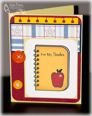
See, the effect of "inner shadow" is more apparent on the yellow. This one again is a layer of stamp images. I took the notebook and enlarged it. Then i took the apple and layered on top as well as the sentiment for my teacher. After filling in all the colors and selecting inner shadow on each layer, i did go to my apple layer and select the normal paintbrush tool but selected the one with the more fuzzy edges. Using white and my opacity at about 55%, i added a little highlight to the apple.
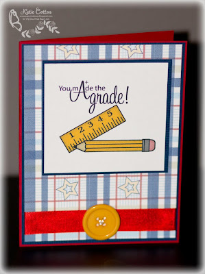
Here's another multi layered image card. I took the ruler (enlarged it) and then using the transform tool (control t) i skewed it so that it would lay on an angle. I then took the pencil image and layered it a bit on top and then added the super fab sentiment that i love (obviously since I also used it on my project yesterday!) The images were color the same way that the ones previously were, even if they are a little smaller. Hint... take the size down in the inner shadow... you should see a toggle that allows you to change the "size" of the shadow. :D
Last but not least...
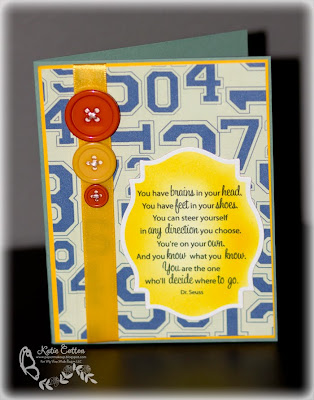
Ok, this one was NOT colored using photoshop. It was simply printed and then i did use the copic airbrush after I cut it out with the nestie. Fading in color ths way is very easy with photoshop, but not with the nestie border around it. So this one was done the "old fashioned" way. :D I do love that sentiment though!
Ok... now off you go to check out the other design teams amazing creations to get you ready to send those kids back to school (right, because you arent secretly ready for the return to schedules and a little bit of extra quiet right?)
Here they are!
Check out the team for all the previews, and amazing ideas!
Have a wonderful day!!!!








2 comments:
Wow! These are fabulous Katie! I don't know if I can get that shading using GIMP...I'll have to see. If not, I NEED Photoshop! They are all so pretty!
Cah-ute!!!!
Post a Comment